Listener
a therapy app
what is listener?
Listener is an online therapy booking app that makes users feel like Listener is listening to their needs and meeting them through its design so they can successfully book appointments with certified and experienced therapists, at their convenient time.
One quote from peer feedback:
“The app made finding therapist less stressful and the process was quite quick and simple”

My Roles & Responsibilities
•Conduct user research, define the problem and provide insights
•Define personas, user journeys, empathy maps, and user flows
•Visual design of low-fi and high-fi wireframes, prototypes, and user testing
Context
The customers are in a need for affordable therapy sessions with flexible online scheduling without compromising the quality of the sessions.
Duration
September 2023 - October 2023
Tools
Figma, Google Docs,
Unsplash, Excel
the problem

Therapy goers are working professionals or students who need affordable therapy and scheduling sessions according to their convenience because of financial constrains and uncertain schedule.
People opting for online therapy want to save travel time and have the luxury of booking therapy sessions at their convient date & time without compromising the quality of the session.
target audience
A specific group of consumers identified as the intended recipients of this product they are defined by shared characteristics such as age, gender, income, interests, behaviors, or other demographics. The app is tailored to meet their unique needs, preferences, and expectations of the specific group.
Demographics
Age: 13 and above
Location: global
Career: working or student
Gender: all
Income: low income to average
the goal
Provide convenient scheduling and financial aid with minimum clutter and confusion
people with busy or unpredicted schedule can choose a time and date at their convenience. They can also reschedule if necessary.
provide financial aid to everyone who is facing a monetary constrain and is unable to access therapy.
qualitative interviews
Understanding user needs and requirements
Conduct interviews with stakeholders and spoke to 5 different end users to better understand the user problem.

A snippet of user interview questions
A snippet of inference derived
interview analysis
Grouped together similar findings to identify patterns and trends in the data.
This process enabled me to develop key findings for the improvement of user experience of the app.
A snippet of user interview questions


interview insights
These are some of the key pain points
1. students & working professionals have a busy schedule, hence they prefer an app that allows them to schedule therapy session at their convenience.
2. not everyone has a stable internet connection to join online therapy platforms.
4. assistive technology is a necessity for online therapy users to make it more useful and effective.
3. financial constrains are one of the major barriers to attend therapy by users
competitor analysis
Analyzed 3 of the global competitors
To understand the competitors and the international market it was crutial to analyze their product, what they offer and their unique selling point. This helped me understand what I could do differently that can help elevate the experience.
A snippet of competitor analysis
_edited.jpg)
_edited.jpg)
_edited.jpg)
use cases
Forming user stories to help simplify and understand the requirements
Next, I worked on my use cases and user stories. It helped me understand what goals the user needs to achieve. It also helped me design primarily of my target audience keeping the user front and center.
User stories used to capture user requirements like flexible scheduling, financial aid, therapist reviews and guide the development process that aligns with user needs and expectations as it is user centered approach.
USER STORIES

User persona is a semi-fictional character representing a specific segment of the product's target audience. Created through research and user data, Helped me empathize with the end users.

USER PERSONA
Helped me optimize the user experience by identifying areas for improvement and ensuring a smooth and satisfying journey.
USER JOURNEY MAP

USER STORYBOARD
It narrates the user's journey, including actions, thoughts, and emotions, in a story-like format. This tool helped me visualize and better understand the user's perspective and context, leading to more empathetic and effective design solutions.

DESIGN PROCESS
INFORMATION ARCHITECTURE & SKETCHING
Focusing on Information architecture helped me bring structure and order as I wanted to prioritized a quick and easy booking process.

INFORMATION ARCHITECTURE
Rapid iterations of each screen of the app on paper ensured that the elements that made it to digital wireframes would be well-suited to address user pain points.

SKETCHING

WIREFRAMING
As the initial design phase continued, I made sure to base screen designs on feedback and findings from the user research.
Key user need to address in the designs:
-
Providing financial aid
-
Choosing user's preferred date & time
I wanted the content, interactions, and features of the app to be accessible for the Next Billion Users who are starting to use the internet for the first time, often through mobile devices.
CREATING COMPONENTS FOR- DESIGN LIBRARY
I started creating components needed based on the wireframes i have drawn. This helps me have consistency and hierarchy across all screens and saved time. I start documenting their usage: do's and don'ts, different states of their instances. This helps me build my design system for the mobile app parallelly and makes my High fidelity mockup process more organized and time saving.

_edited.jpg)

LOW FIDELITY PROTOTYPING
Using the completed set of digital wireframes, I created a low-fidelity prototype. The primary user flow I connected was booking a therapist, so the prototype could be used in a usability study.
USABILITY STUDY FINDINGS
One choosing date & time is cluttered. Two search bar and progress indicator bar needed. Three simplified an detailed payment option.
_edited_edited.jpg)
ACCESSIBILITY CONSIDERATIONS
1. The app provides ‘Financial aid’ for people with financial constraints to access therapy as everyone else.
2. The app uses a ‘progress tab’ to help users get a clarity on where they are at in the user flow.
3. primary colors met WCAG AA Compliance and provide positive emotional experience enhancing user satisfaction and loyalty.
I considered the emotional impact of colors, imagery, and interactions before building out the UI for each screen.
4. I am using only one typefaces: Inter establishing a clear visual hierarchy to guide users through the interface.
Along with visual cues like size, color, and contrast create a natural flow of information.
Walkthrough of main UX changes after usability study
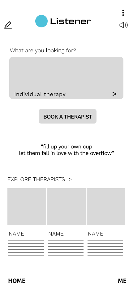
finding 1
Minimalistic Homepage
The home page provides two main options
'Book a therapist' this helps people directly get to the process of booking a session.
'Explore therapist' this option let's users first explore direct therapist bio's and then book a session.


finding 2
Simplified Date & Time Page
Early designs allowed users to select date & time but after the usability studies, I added a scrolling feature for them to choose month and time.
finding 3
Progress Tab
This progress tab helps users be aware of what part of the user journey they are at.


finding 4
Informative & Inclusive Questioner Page
All the screening questions asked to the user for the app to find best therapists are inclusive and mindful. Important information and further explanations are also provided in a purple box just below the end of each question.
finding 5
Therapist Bio and Reviews
The user reviews are provided for each therapist to build trust and ensure credibility. It also allows new users to read experienced users insight.


finding 6
Multiple Mode Of Payment And Financial Aid
The second usability study revealed frustration with single mode of payment hence, multiple mode of payment for user convenience is designed.
I also added the progress tab to this screen for user awareness and convenience.
The financial aid option is provided in the same screen to reduce the number of clicks and help users bridge their financial barrier
finding 7
Confirmation Page
Confirmation of the session booked with the details like date, time, therapist name and amount paid are all provided.
The page also contains a 'Benefits' section where the users are made aware of all the benefits the app provides them with.
This keeps the users informed and interested in further exploring the app.
